UI Comparison: SushiSwap VS Uniswap
May 2021

Uniswap is the gold standard for token swapping, it’s the way most people swap ERC-20 tokens in a decentralized way. In 2020 SushiSwap forked Uniswap and since their UI’s have diverged.
Let’s check out how they differ.
Note: Because Sushiswap’s UI is dark, I choose to compare it to Uniswap’s dark mode.
Landing Pages


At first glance, we can see Sushiswap takes advantage of being able to do whatever they want in a world where finance applications are traditionally really, really boring. The site is filled with beautiful illustrations, neon glows, and gradients. Their UI has come a long way in the 9 months since their launch.

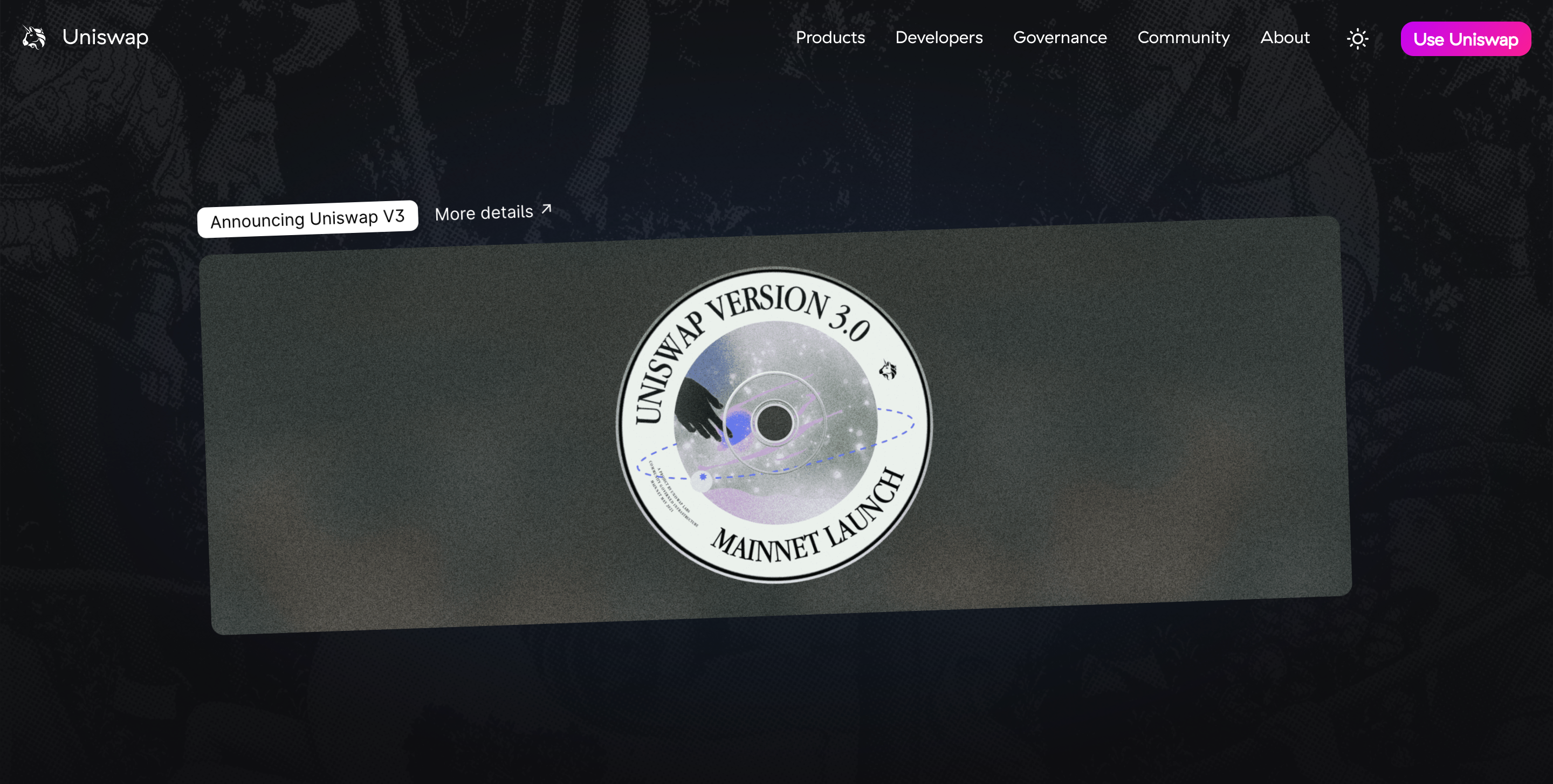
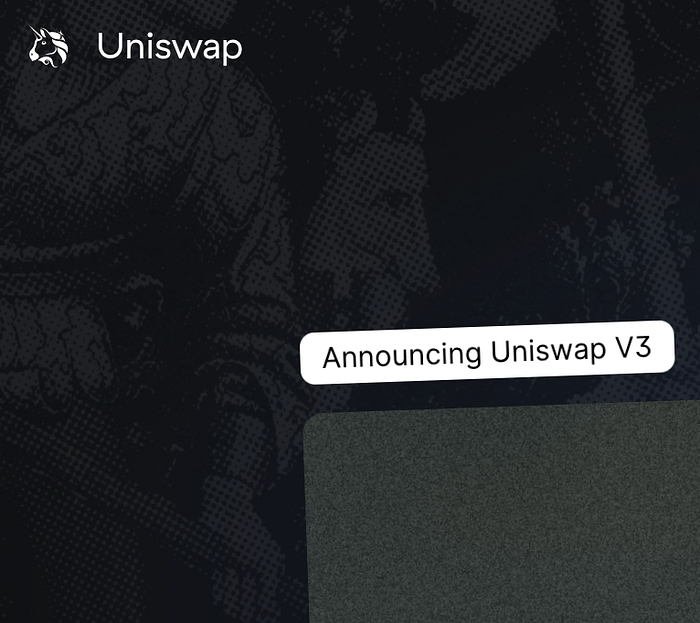
When the exchange landing pages sit side by side, Uniswap appears lackluster. I would love to see Uniswap push their branding as far as Sushi’s. It seems like they have a medieval background on the home page but it’s unclear how this fits in with the rest of their branding.

And while I’m not running official WCAG testing here, it has some contrast issues in their numbers down the page. The lack of contrast is also evident in the light theme version.

Learn More
Uniswap has a lot of content in their top navigation that Sushi puts in their bottom nav making it a little busy, but I’ll give it to Uniswap for having a better FAQ. I think this is really important for inexperienced users because DeFi in general is confusing and complex and can have an intimidating community. I think any exchange that takes an “Explain Like I’m 5” approach could capitalize on bridging mainstream adoption.
Uniswap is off to a good start in this respect: it has multiple pages that include FAQ sections that break down content into digestible chunks that don’t make the user spend 30 minutes googling a paragraph’s worth of content.
When a user clicks “Learn More” on the Sushiswap homepage the screen slides down to projects that an inexperienced user probably doesn’t understand the context of, and I have yet to find a spot that simplifies anything in detail.

Swapping
I appreciate Uniswap’s minimalist centered arrow, but Sushi really minimizes the chance for user error.

Analytics
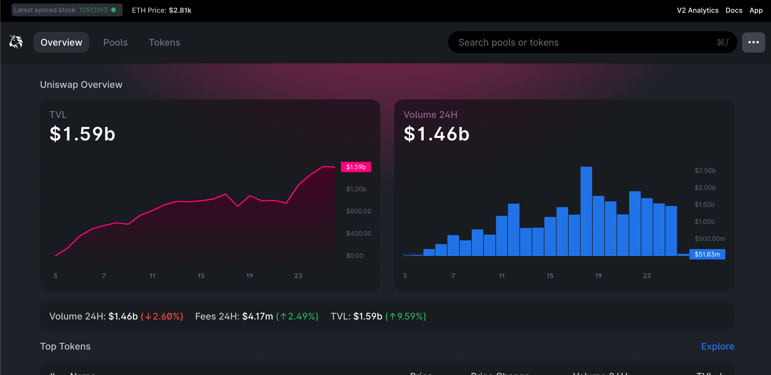
Sushi has a unique take with gradient fills on charts but it’s missing X and Y axis legends, so I’ll give it to Uniswap for being more user friendly with their traditional charts.


Cards and Icons
Sushi cards have more finesse and cohesiveness with custom icons that match the rest of the page, Uni’s art styles lack unity.


Illustrations & Graphics
Sushiswap is filled with amazing illustrations and even includes individualized graphics for each employee in their “Meet the Team” section. The two graphics I could find in Uniswap were the very dimmed medieval graphic in the background and the V3 announcement on the landing page. There are so many competing styles here, from the logo to the graphics, and the very saturated gradient on the “Use Uniswap” button in the top right.

Summary
Uniswap is the decentralized exchange leader in the world of Ethereum and it’s probably the first stop for new DeFi users, but Sushi’s unique style wins the UI cake! I appreciate Uniswap’s efforts to educate more inexperienced users and I think it does do a more effective job in this regard, but overall Uni would benefit from more cohesive branding and stylization.
For Sushi’s part, they could do a better job onboarding inexperienced users.
There are deeper comparisons here to be made, including what power users like liquidity providers see when staking tokens to a liquidity pool. But, I’ll save those for further blog posts.
Let me know if you have any thoughts, comparisons, or preferences you have between the two!
